Tell a more complete data story with customized Looker charts and visualizations
Jeremy Chang
Developer Relations Engineer
Data is just a collection of numbers — unless you can use it to gain information and tell a story. At Google Cloud, we are continually expanding Looker’s capabilities to help you tell your data story and collaborate with metrics you can trust. Recently, we expanded the ability to convert out-of-the-box Looker visualizations with bullet chart, sunburst, venn, and treemap visualizations for Looker Explores and dashboards, using the Chart Config Editor. To help you get the most from these new visualizations in Looker, we wanted to share some tips on how to use the Chart Config Editor to best enhance your visualizations and create impactful data experiences.
For those new to the Chart Config Editor, Looker visualizations use the Highcharts interactive charting library to display your data, and the editor exposes parts of the Highcharts library API for you to configure your visualizations. In this post, we dive into the Highcharts API and learn some Chart Config Editor tips and tricks to improve your visualizations. To get the most out of this post, you should be acquainted with the JSON format to fully understand our examples, and have Chart Config Editor access.
Configure each line’s appearance and labels in a line chart
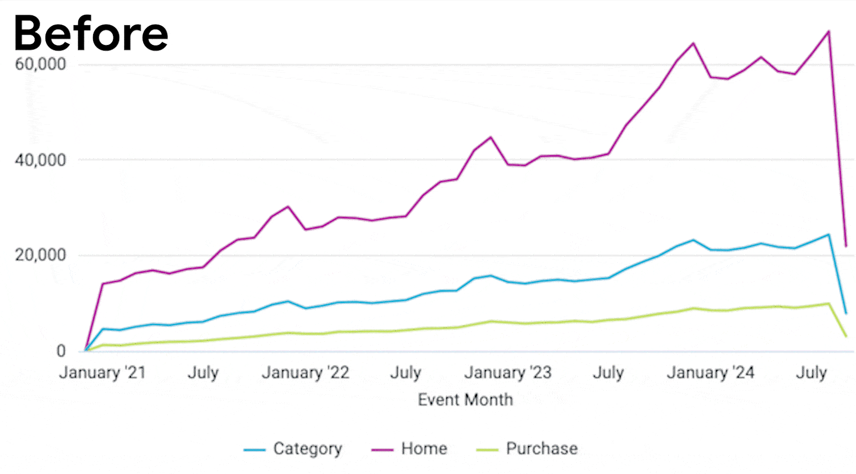
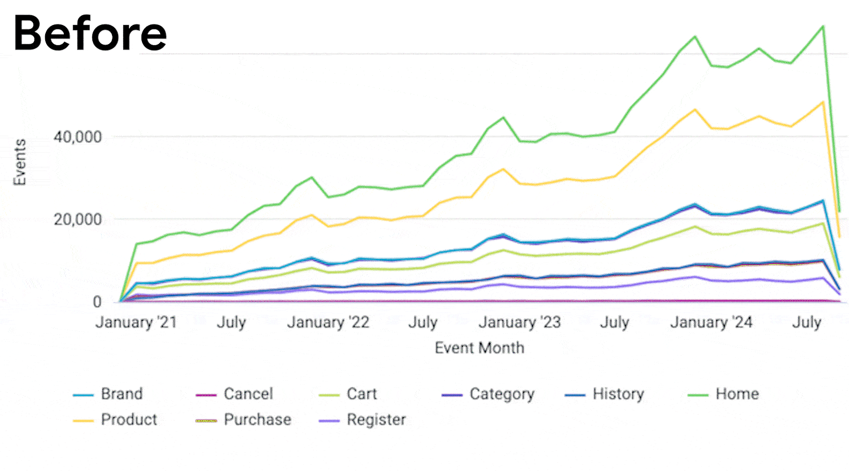
Imagine you have a line chart visualization displaying multiple time series with one line apiece. You may have a hard time differentiating between the lines in the dashboard viewer, or you may want to emphasize the importance of one line over the others. You can apply Highchart’s multiple `series` attributes to affect the style and presentation of each line. The attributes include:
-
`dashStyle` to change each line’s pattern
-
`lineWidth` to change the thickness of each line
-
`opacity` to change each line’s opacity
-
`dataLabels` to apply labels to a line’s data or values
Each `series` attribute can be applied in any combination to help your stakeholders understand your line visualization’s data. The Chart Config Editor configuration sample below differentiates the third “Category” line from the other line by increasing the line width and enabling data labels on the third “Category” line, while reducing the opacity and setting a dot pattern for the other lines.
You can further simplify the above sample configuration by using Highchart’s `plotOptions` attribute to set the default styling across all lines. You can then further customize specific lines with the `series` attribute that overrides default styling. The Chart Config Editor configuration sample below demonstrates the default and overriding styling:
Enabling inline scrolling for visualizations
Consider a column chart visualization with a date time x-axis that spans multiple decades, with one column per month. Over time, the widths of each column shrink, and the monthly or yearly trends become compressed — hard to understand as your visualization is limited by the width of your dashboard. Instead, try out Highchart’s `chart.scrollablePlotArea` attribute to define the width of your visualization so your stakeholders can horizontally scroll through a column or line-chart visualization. You can set the minimum width of your visualization with the `minWidth` attribute and also use the `scrollPositionX` attribute to define the initial scrolling position of the visualization. The Chart Config Editor configuration sample below sets the minimum width of the visualization to 2,000 pixels and sets the initial scrolling position to the right side.
Also consider experimenting with the `minHeight` and `scrollPositionY` attribute to enable vertical scrolling in your visualizations.
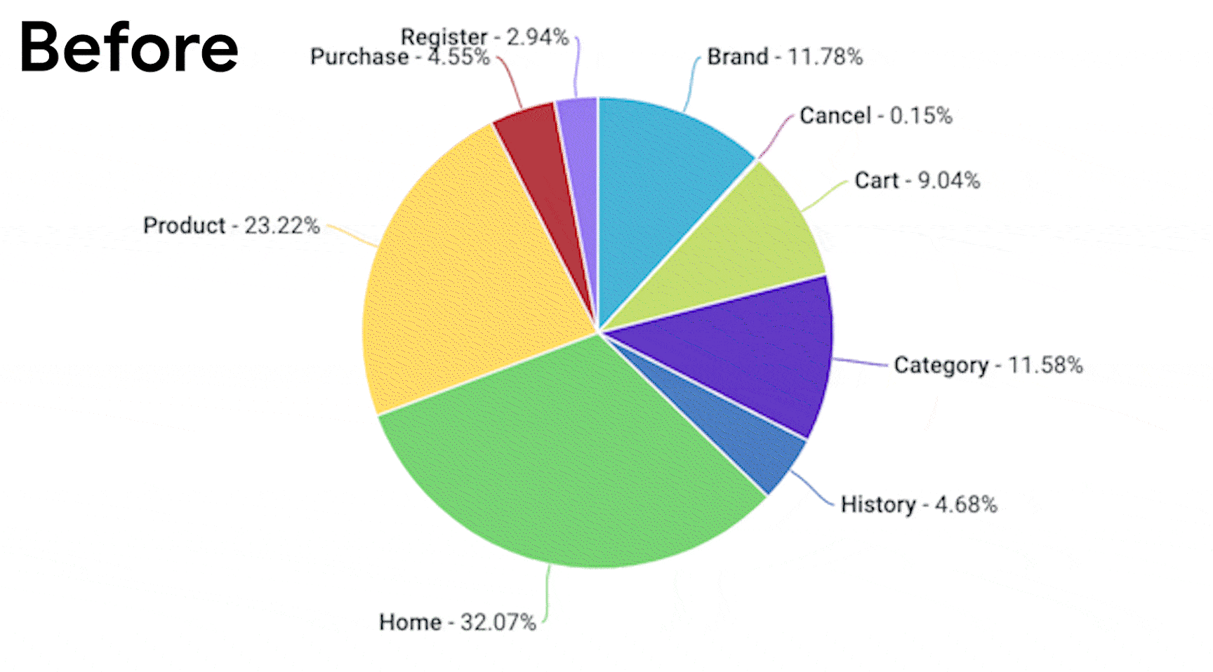
Fully customize the data labels for a pie chart and other chart visualizations
A pie chart visualization’s plot menu options let you label each pie’s slice, but, typically, you can only show either the slice’s percentage or value, not both. The viewer has to do double duty and glance between the legend and data labels to understand all the data. And while they could mouseover each pie slice to see all the data, it won’t be available in a scheduled PDF delivery of the dashboard that contains the visualization.
With the Chart Config Editor, you can display any of the information that’s available on the HighCharts PointLabelObject on the data labels, including the percentage and value simultaneously, and further customize the labels with HTML to help your stakeholders glean information quickly from your charts. You’ll need to configure the previously mentioned Highchart `dataLabels` attribute from our first example to affect the style and format of a chart’s data labels. The `dataLabels` attributes to configure include:
-
`enabled` to enable data labels on the chart, as mentioned in our first example
-
`useHTML` to enable HTML formatting of data labels
-
`style` to set CSS styles across all data labels
-
`format` to define the format and piece
The Chart Config Editor configuration sample below displays the pie chart’s data labels with a 12-pixel font size. For the `format` attribute, all of the PointLabelObject’s properties can be displayed in the data label if the property name is surrounded by curly braces. The sample sets the `format` attribute` to a string containing:
-
the name of the pie slice in bold with the PointLabelObject’s `key` property inside an HTML Bring Attention To element
-
the data point’s value with the PointLabelObject’s `y` property
-
and the data point’s percentage with the PointLabelObject’s `percentage` property formatted with one decimal places
The resultant data label is formatted to look like this: Category - 596524 (11.5%).
Note that the `dataLabels.format` attribute operates similarly to the `tooltip.format` attribute; you can find further guidance in the documentation. Also note that we make use of the `plotOptions.pie.dataLabels` attribute for pie charts. If you want to apply the same data-label formatting to a line chart, you must override the `plotOptions.line.dataLabels` attribute instead. The `dataLabels` attribute of different types of charts share mostly the same interface and functionality.
Make your charts smarter and more impactful
We hope these examples serve as a starting point of your journey to explore the HighCharts API and see how you can configure your Looker visualizations to tell impactful and helpful stories. You now know how to use the Looker Chart Config Editor and HighCharts API to customize the style of each series of your data, enable inline scrolling of visualizations, and customize data labels.
To learn more, check out the documentation on Looker’s Chart Config Editor, and try out the new visualization types the editor makes available to you for your Looker Explores and dashboards. We will be back soon with even more Chart Config Editor tips that will make your data stories pop.